Format–Messaging Fit: The Secret Behind Scalable Beauty Ads
💡 The Insight
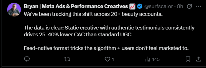
Beauty brands that are still forcing UGC and story-driven videos into their top-of-funnel are quietly getting outperformed — by static ads.
Native static creatives (images that blend naturally into the feed) are absolutely smashing CAC benchmarks right now.
⚙️ What’s Working
-
Native feed-style statics
- Clean, natural-looking images that don’t “feel” like ads.
- Simple layout, testimonial or tweet-style overlay, subtle branding.
- Works because users pause longer on content that looks organic.
-
Social proof first, storytelling second
- Lead with proof (reviews, stats, “#1 Dermatologist Recommended”) before narrative.
- UGC that performs is proof-led, not experience-led.
-
Founder credibility
- Static founder images with quotes or short statements keep scaling.
- Founder = trust signal; combine with testimonial snippets for max effect.
-
Aesthetic trust > emotional storytelling
- People now associate polished visuals with legitimacy.
- Your “raw” UGC might feel cheap in high-trust categories like skincare.
🧠 The Big Shift: “Us vs. Them” Messaging
Forget “here’s my pain point.”
New winning angle = “Here’s why we’re better than what you’re already using.”
Example:
“You’ve tried serums that dry out your skin — here’s why dermatologists are switching to [Brand].”
This creates contrast, frames authority, and naturally justifies switching.
🚀 How to Apply
- Audit your top ads — Are they too story-heavy or vlog-style?
- Build 3–5 static variants that look like native posts.
- Overlay real reviews, data, or founder lines.
- Test “us vs them” copy hooks in your captions and headlines.
- Track CAC over 14 days. Most brands see lower acquisition costs immediately.
🧠 Top Platforms to Apply the Format
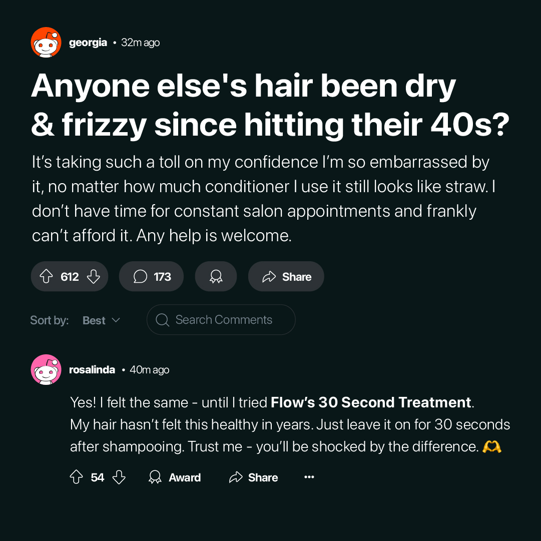
1. Reddit
- Use native static visuals styled like screenshots or testimonials.
- Post in niche subreddits as case studies, comparisons, or user experiences.
- Example: “Tried 3 top serums — only one actually worked (here’s proof).”
2. Quora
- Turn the “Us vs Them” angle into answers comparing products or methods.
- Use statics with data overlays or before/after results.
- Link out subtly to your offer or landing page.
3. Facebook Feed Ads
- Native-style image + quote/testimonial overlay.
- Run through Page Posts or boosted content.
- Blend into feed visuals, not polished ad designs.
4. TikTok Spark Ads / Organic Posts
- Combine static frames with short animated text.
- Use “comparison” hooks like “Why this works better than [Competitor].”
- Proof-led > Story-led.
5. Instagram Feed + Story Ads
- Native statics = polished but casual.
- Use carousel format for “Us vs Them” comparisons (Competitor vs You).
- Add testimonial proof or founder quotes.
6. Pinterest
- Perfect for beauty, lifestyle, or wellness.
- Use static comparisons (“This vs That”), before/after layouts, or stat overlays.
- Add soft CTA to blog or quiz funnel.
7. Twitter / X
- Native statics styled like tweets or news screenshots.
- Combine with threads comparing common misconceptions vs your solution.
- CTA to full breakdown or case study.
8. LinkedIn
- Works for SaaS, coaching, and service brands.
- “Us vs Them” = traditional vs modern solution positioning.
- Use native-looking statics with data proof or testimonial quotes.
💰 Bottom Line
If your scaling has slowed, it’s not your product — it’s your format–messaging fit.
Switch to native statics with proof-driven angles, and you’ll see performance rebound fast.